Fair Supply
Summary
Fair Supply is an environmental accounting and risk-management tool helping businesses understand the ethical and compliance impacts of their activities. Created by a super talented team of mathematicians, legal & environmental experts and product geniuses. It’s corporate responsibility done right.
I joined Fair Supply as a contractor to help launch several key projects and set the team up for lasting success — working across design systems, new features and coaching. Being the dumbest person in a room full of experts transformed my passive interest in environmental ethics into a genuine passion!
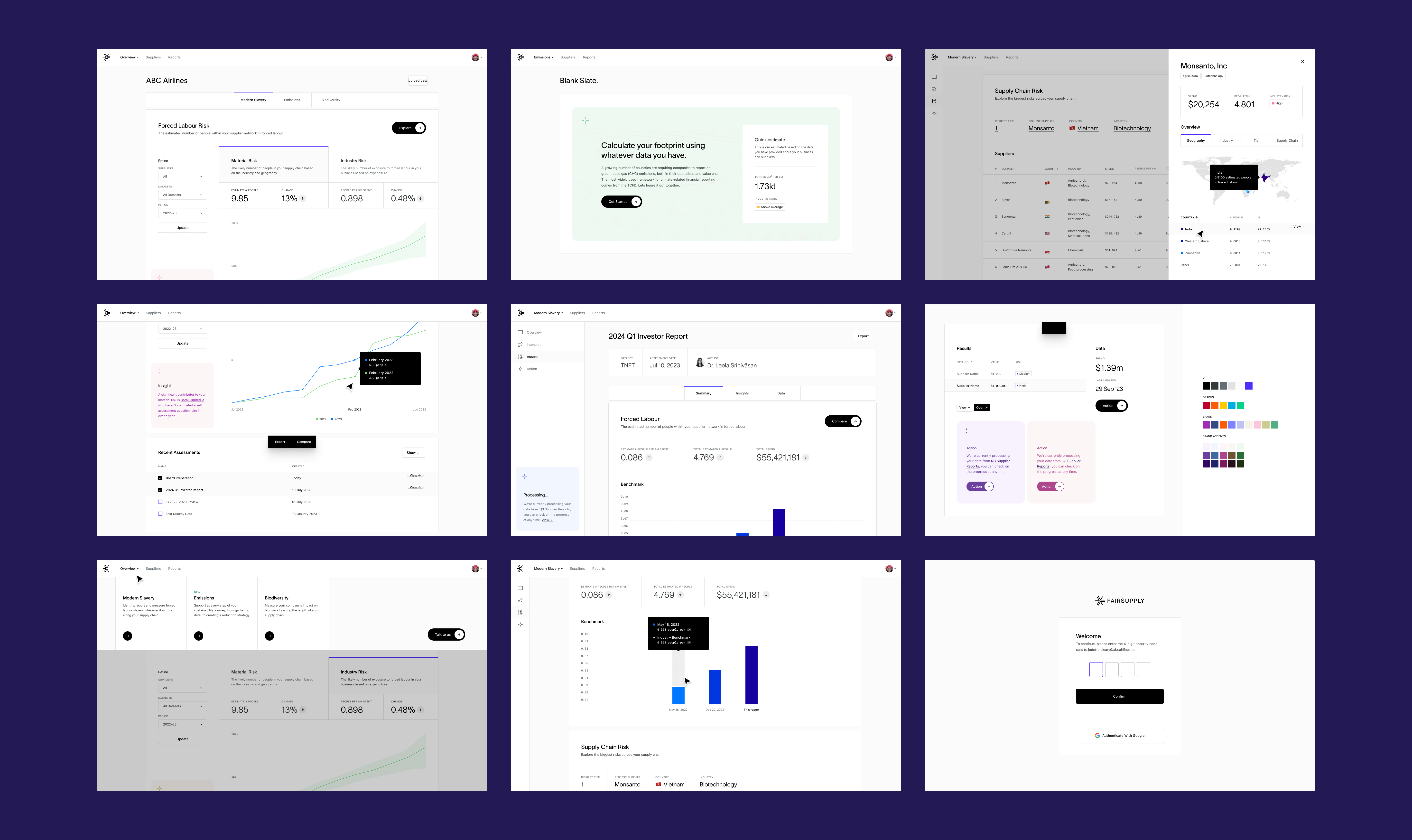
Below The visual direction I created for the different types of structures within the product

A new visual language ✴ Direct link
With a solid product and market fit already in place, one of my first tasks was to align the visual design with a recent rebrand. The external brand team had done a fantastic job positioning Fair Supply for the future, so my role was to collaborate with leadership and the internal design team to establish a cohesive visual strategy and design system.
While the existing UI was functionally complete, it was incredibly complex — using it required not only a stiff drink 🥃 but also an in-depth knowledge of ESG, a luxury that many current and prospective customers might not have.
With that, the core challenge was to simplify the UI for quick, clear insights while still allowing users to add as much detail as they needed. This approach was guided by core principles, such as data-first design, supported by a robust grid system and progressive disclosure of information to manage complexity seamlessly.

Information is intelligence, celebrate it 🎉
In past projects my focus has often been to simplify or obscure data to enhance usability. But here, the data is the feature — front and center — demanding clarity and depth. After-all, data is what makes the platform useful.
Though initially daunting, it was a refreshing challenge to create a space for thousands of graphs, data points, insights, and tables. Designing an interface that accommodates billion-scale numbers and intricate data descriptors was as fun as it was mind-bending.
Below You can’t hide from tables and graphs!

50 shades of blackDirect link
A key visual choice we made was prioritizing data over aesthetics. I encouraged the team to embrace a nearly all black-and-white UI, reserving color solely for highlighting data. These constraints pushed Fair Supply to be one of the most challenging visual projects I’ve taken on — and led to some truly unique results.
With these self-imposed constraints, we had to find creative ways to infuse brand personality and a bit of fun into the UI when the moment was right. This approach allowed us to spotlight insights and bring a smile to users without detracting from the serious work at hand. Details like this:
Play with the original prototype I coded here
An unexpected benefit of reducing brand bias in the UI was our ability to present unfavorable data neutrally and without risk to the brand. This abstraction allowed us to communicate critical insights — like “you need to address the serious modern slavery risks in your supply chain” — without coming across as pushy, preachy, or alarmist. This balanced tone helped create trust and encouraged users to engage with the data thoughtfully.
These were also moments where we could inject a little fun, and presented one of the only times we used rounded corners:

Carbon, with a side of AI Direct link
One of Fair Supply’s standout features is a powerful calculator that combines AI, vast datasets, and Nobel Prize-winning data modeling techniques to help companies pinpoint the carbon impact of their activities.
This ethically important insight usually costs thousands through private accounting firms, but Fair Supply wanted to make it accessible for free. To kick things off, I was given a stack of spreadsheets and direct access to a team of environmental PhDs, ready to bring this vision to life.
Using the newly established visual framework, subtle human touches, and vast data sources, I set out to design a calculator that balanced visual appeal and ease of use with deep insights and functionality.

The result is a user-friendly calculator offering immediate insights, estimates, and guidance for newcomers — while also meeting the exacting needs of users who bring their own data. My goal was to create a tool capable of handling complex inputs — like KT/Scope 2 CO2 emissions — without requiring users to grasp technical jargon. In essence, it’s a calculator anyone can use, yet sophisticated enough for the most data-savvy experts.


As one customer bleakly put it, when it comes to emissions calculation “we’re just arranging deckchairs on the Titanic.” Making people feel hopeful was a delicate balancing act. Despite the gravity of the issue, I wanted to find ways to reward effort and empower customers to drive even small changes within their organizations.
One of the most effective tools we used to achieve this was building a sense of mastery. By delivering clear, actionable insights — we provided customers with understandable data-enriched outputs that helped them feel informed, capable, and ready to advocate for meaningful change within their organization.
This was the output of the emissions calculator:

Data is subjective Direct link
The defining theme of my time at Fair Supply was developing straightforward solutions for deeply complex problems — without compromise or trivializing the data.
One of my favorite examples was tackling how to communicate that some information was an “educated guess” — based on estimates and intelligence, but still an approximation. To maintain transparency without undermining usability, I introduced a data-reliability rating that could be displayed alongside any data point. This approach offered users a clear sense of accuracy while encouraging them to strengthen their data sources, striking a balance between transparency and trust.


Our rating scale tells customers where their data can be used.