Skype
Summary
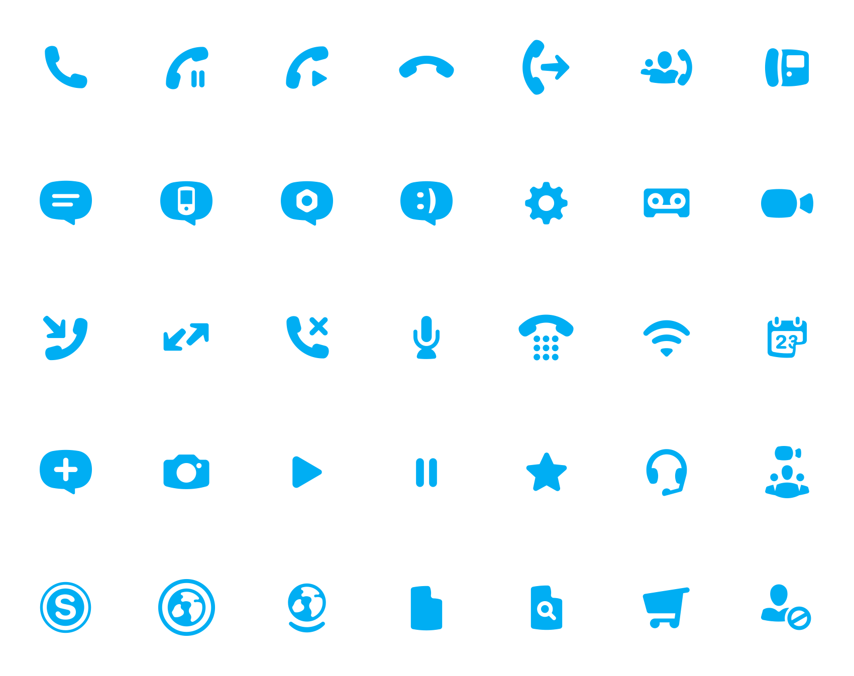
I was tasked with creating a family of icons to be used in the future of the Skype product suite. My brief was to re-draw all 80+ existing icons to work across multiple platforms and cultures — whilst being recognisably “Skype”.
Concept Direct link
A project of this size — that touched so many parts of the product — needed a careful approach. Working in collaboration with the wider product team led by Steve Pearce, we started with research, sketching and a lot of iteration.
Having never designed icons before (talk about a steep learning curve) my main source of inspiration was the incredible IconWerk — whose use of negative space was a big influence. Here you can see me (right) questioning existence itself.


An exciting part of the design process at Skype was the research and testing. Since the product is used by audiences of all ages and demographics spanning unique cultures — our iconography needed to be recognisable by all. Much like the infamous floppy disk to represent ‘Save’ — a rotary phone is understood by older audiences, but not by younger ones. Similarly the throwback of a webcam was too abstract for some people.
Still, I didn’t totally nail it.

Mathematical! Direct link
To ensure that the entire set scaled down on hand-held devices as well as up to HD TVs (and beyond) we enlisted the help of a mathematician who I worked with to find a rate of curve, grid and angles that could scale without compromising the construction of the shapes. This meant that each icon needed to follow a very strict formula and construction guide to how it was drawn.


Bringing it all together Direct link
Icons needed to work well individually and as part of a set, whilst also holding onto their unique Skype style. A frustrating but important part of the process was to construct an icon (as above) then tweak it to feel harmonious with the entire set. Rinse and repeat.


Usage Direct link
The icons I designed were used by Skype across their entire suite of products for over a decade — until it was unified into Microsoft’s UI style. A pretty good tenure for digital work. During that time, I was proud that my work was seen by an app your gran uses!

And finally… my work featured in the movie, ’Unfriended‘ (image courtesy of Universal Pictures). I’m still not sure how I feel about this.
